
Those long, hot days of the summer of 1976 – when people travelled from Britain to the Mediterranean for their holidays and found it cooler there than at home – now seem a very long way away.
So wrote former Department of Environment Government minister Denis Howell in 1979 for the Foreword of the Atlas of Drought in Britain 1975-1976. Despite its slightly dry (forgive the pun) title, it is an atlas that deserves to be better known, given how resonant the topic is today.
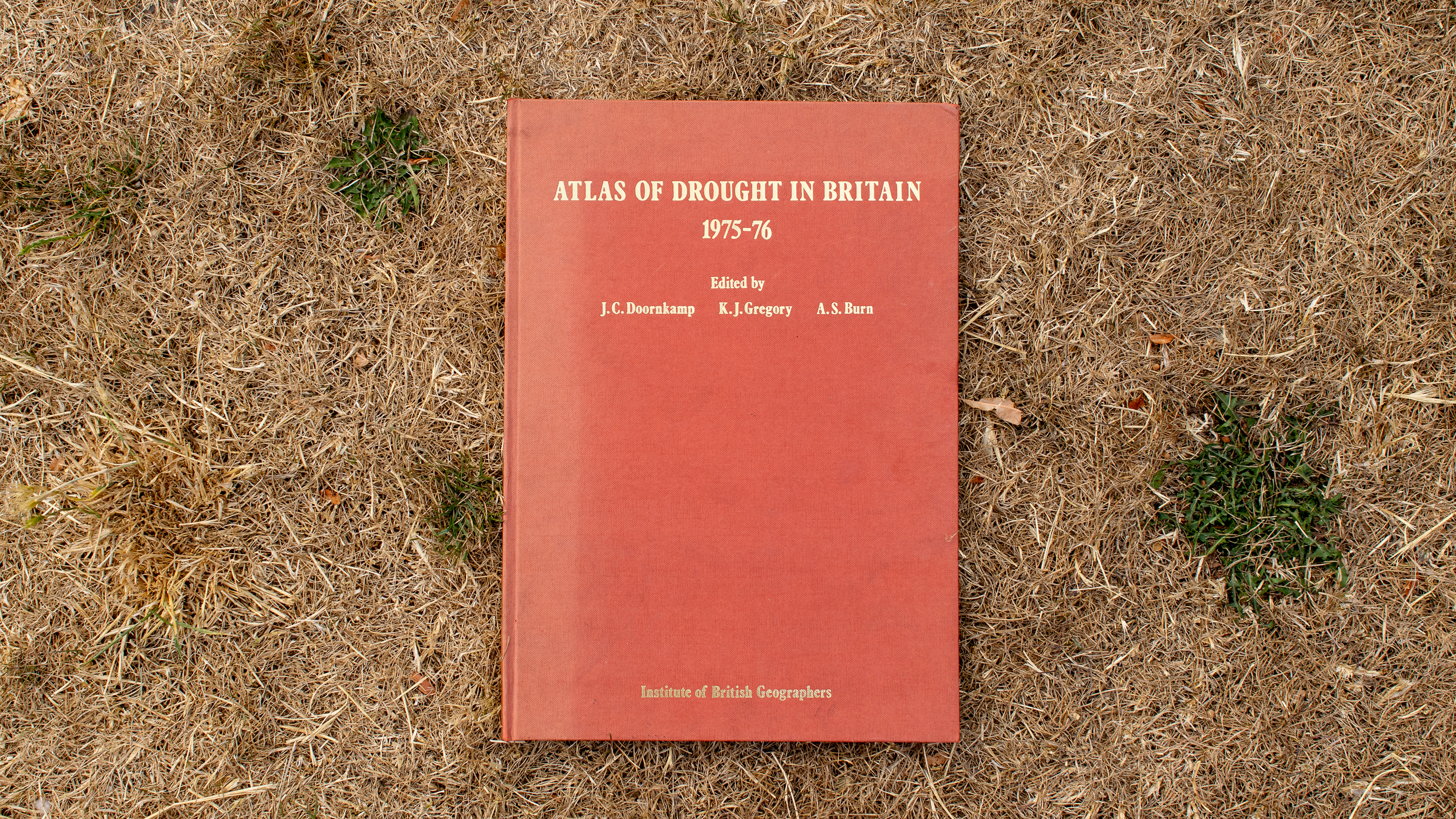
Published by the Institute of British Geographers (now joined with the Royal Geographical Society), the Map Library has two copies so I took one to a local park to photograph it amongst the parched grass of the summer 2026.

Weather
The atlas offers a comprehensive meteorological explanation of what happened, focussing on “blocking” high pressure systems keeping the rain at bay.

It taught me that the 1976 drought was much longer in the making compared to the one we are currently experiencing (in August 2026). This is because, as the map below shows, there were a lot of blocking anticylones, during the year prior to August 1976.
The term “flash drought” is being used for 2026’s conditions because the preceding winter was wet, so reservoirs and groundwater were at good levels, but no match for the rapid onset of the intense heat and dryness we have been enduring.

In addition, as the atlas details, the extent of the most intense area of drought, was sat over the South East of England in 1976.

Southern Europe (such as the south of France and central Italy) experienced relatively mild deficits or even increases in rainfall during between May 1975 and August 1976.

With drought conditions across almost all France, it is a very different picture today, as the European Dought Observatory map (snapshot taken 9th August 2026) shows.

[I have spotted that the Drought Atlas does not have data for all the countries above, and indeed a lack of rainfall is not the same as drought, but there is no doubt about the extent and intensity of the 2026 conditions!]
Vegetation Fires
During the “normal” summer of 1974 there was a montly average of 4,874 vegetation fires across the UK, but the comparable value for 1976 was 48,674. This was mapped across four different measures in the atlas.

The Media
With each new temperature record that tumbles the UK, climate skeptics have a standard stock phrase: ‘it was this hot in 1976’. Crucially, the planet overall was not as hot then as it is now, a fact that parts of the UK media have had their part to play in downplaying.
In his accompanying text Ken Gregory, on of the atlas’s editors, writes:
Extremes of weather conditions such as the 1975-1976 drought can be approached objectively employing established scientific methods, but the significance of the characteristics of a specific period of weather as perceived by the population as a whole depends upon the diffusion of information and upon the way in which it the physical events are portrayed by press, radio and television.
I think this is a fascinating insight given how firmly lodged ‘the heatwave of 1976’ is so firmly lodged in the public consciousness of the UK thanks to the media’s reminders of it. It was also made in the era before the extent of human induced climate change was appreciated, so there is no sense that the hot and dry conditions were a sign of things to come.
There were interesting geographic differences in the length and timing of the reaction. Gregory noted that, for example, those regions benefitting from groundwater supplies, such as Southampton and Reading, moved on much more quickly from the issue during the autumn of 1976, whereas areas such as Derby were still suffering the effects of near empty reservoirs. The plot below gives an indication of how quickly interest grew and then slowed set against key events that year.

Of course the Internet and the decline in local media outlets means that such a map would not be possible to create today so we’d struggle to recreate Gregory’s analysis, but I would love to do a follow up to see how the media back then generated a collective memory that still impacts on perceptions of the record breaking summers we’ve had since 1976.
Salvation in ’76 came from an unusually wet September and October, as shown in the graph below, which captures the full chronology of the drought.
Who knows how quickly the 2026 recovery will be.

If you enjoyed this post then you might also enjoy The Library of Lost Maps. Pick up your copy here.